Equestrian Apparel Articles
How to Dress for a Hunter Jumper Show
If you look like you know what you're doing, you're halfway there. Looking put together helps to establish your authority while riding and gives you confidence. And while you should ultimately wear what makes you happy, there is always the question of "what color looks good on my horse?" Have no fear, we are here to help! Picking the right color or mix of colors can create a picture-perfect image and help you to be your most confident self in the saddle. In this style guide, our crew of equine experts will go over which colors look good on which coat colors, leather and metal color choices, as well as show attire. Read on to learn more about riding in style!

Just like how certain colors look good on different people based on their hair and complexion, certain colors look good on different horses. There are some general rules that make it easier to determine what color looks good on what coat. The first rule is that the best colors are those that are complementary to your horse's coat color; this means that they are on the opposite side of the color wheel from each other. For an even deeper dive into complementary colors, check out this interactive palette generator that can help you determine complementary colors, pairs, or palettes for your horse.

Take a look at the color wheel of primary and secondary colors. Find your horse's coat color name on the outside of the wheel, or look for the color most similar to their coat. Now look to the opposite side of the color wheel for your horse's complementary color.
If you want more options to dress up your horse, find your horse's coat color, look to the opposite side, and use the two colors neighboring the single complementary color. This will give you your horse's split-complementary colors.
Using a color that is too similar to your horse's coat color can wash them out or even make their coat look dull and dirty. Examples of this would be red on chestnuts, yellow on palominos, and white on gray/white horses. Here are some suggestions for which colors look good on different coat colors:

Along this same color theory, try to avoid dark colors on dark coats and light colors on light coats. As mentioned before, the too-similar coloring can emphasize dirt or dullness of your horse's coat rather than help them stand out. If your horse has a bit of a mousey and soft coat, bright and bold colors are a great way to add flash. Likewise, if you have a horse with a very bright and flashy coat, more subdued colors can bring a much-needed balance to the appearance. If you're not one for bold outfit choices, colorful accessories or accents are always a good option and can give that extra oomph without pushing the look over the edge.
Again, these color pairing suggestions are just that: suggestions. You should wear colors that make you happy! There are more suggestions for color and outfit guidelines when dressing for shows or more formal events, which we will go into shortly.


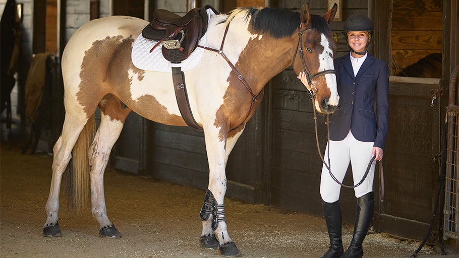
Along with choosing colors for saddle pads and such, choosing colors for leather is a fun way to up your style game. Granted, these considerations have to be made fairly early on since most equestrians are not going to buy a new saddle or bridle simply based on color. Leather tack is often offered in black, light brown/tan, or dark brown, with specific variations depending on the item or company. If it is discipline-specific tack, it may only be offered in one color unless made custom. For example, most dressage tack is only offered in black, but more brown options are becoming available.
Generally, the color of leather follows the same rules as the previously mentioned suggestions, with dark leather looking nice on light horses and light leather looking good on dark horses. Depending on the level of contrast you are looking for (such as riders who prefer when their tack blends into their horse), the color that looks best on your horse may vary. The appeal of contrasting tack to coat is that it gives your eye "landmarks" and contributes to compartmentalization; this helps us to identify how the horse's individual body parts look rather than looking at the entire image (including the rider) as one unit.
Additionally, metal fixtures can vary on tack and are often offered in silver or brass. Metal fixtures can be looked at similarly to humans and jewelry. Some people are gold jewelry wearers and some silver wearers, based on their skin tone and hair color. The same thought should go into tack! Generally, horses who are cool-toned (mostly black and grey) look better in silver, and warm-toned horses (chestnut, bay, palamino) look better in brass.
This is mainly applicable to the bridle or headstall since most metal fixtures on saddles are covered by leather or the rider. Obviously, some metal is made to be shown, such as on western pleasure saddles, and this is almost always silver.


Depending on the discipline you compete in, there may be rules in place limiting what you can and cannot wear. In dressage, conservative colors are encouraged, but riders still find ways to show style and flair in the court. Neutral and conservative colors not only look professional but are helpful at hiding imperfections to create a cleaner picture. For example, dark-colored gloves help to keep the rider's hands out of the spotlight, whereas white gloves point them out. Similarly, the color of the breeches, pants, or chaps you choose can help to elongate your leg and make it appear steadier, which is favored in many disciplines.
In English disciplines, black, navy, and hunter green are common show-appropriate colors and look good on a variety of horse coat colors. Historically, men wore black show attire and women wore navy, but that has since changed and now riders can wear whichever color they please. Additionally, in English shows, white or tan breeches are worn depending on the level or type of show. For example, in hunters, tan breeches are more common, whereas white breeches are more common in dressage.
For English horse show tack, white saddle pads are most common. However, dark navy or black are widely seen on gray and white horses to avoid emphasizing dirt and variation in color. In hunters, a white profile pad is almost always the only pad seen in the show ring.
The most variation and experimentation in color is shown in the cross-country portion of eventing and in the jumper ring. In cross country, riders often have their "cross-country color" they use for a helmet cover, saddle pad, horse boots, shirt, and more. They are commonly barn colors or individual to the rider and might feature a pattern. In jumpers, uniquely colored show coats are becoming more common, as well as colored saddle pads and accessories. Other disciplines (like endurance, combined driving, and barrel racing) are much more flexible with attire and tack color choices.

Depending on the western discipline, there might be rules in place governing what you and your horse can and cannot wear. Make sure to check your specific governing rule book for these guidelines, since we are only going over general style tips. One of the most prominent style tips is to match your boots to your chaps as closely as possible. In many disciplines, a long leg is desired, and loud, obvious feet are discouraged. Matching your boots and chaps creates one cohesive image and removes distractions.
Furthermore, it is recommended to match your hat to your boot/chap color as well. If you do not choose to match the hat to these, make sure to use your hat color somewhere else in your look to maintain cohesion. This rule really applies to everything in your outfit, as having one instance of a color makes it look random and uncoordinated. For example, if you have decorative cuffs and a collar on your shirt, match those colors or patterns to your saddle pad.
When looking at bright versus more conservative colors, it is more common to see junior and young riders in bright, flashy colors, and adult amateurs and professionals in conservative colors. This is just a common trend, and if it makes you happier to use a specific color that doesn't correlate, go for it! At the end of the day, feeling confident in your personal style is more important than what trends dictate. We simply encourage taking into consideration that judges or onlookers may value the trends more.

These color theories can be a lot to remember, so here are the quick do's and don'ts of equine style for your convenience!
DO: Use complementary colors to your horse's coat. For example, use blues and greens on chestnuts.
DON'T: Let style get in the way of functionality. Think about whether your discipline requires you and your horse to move quickly and emphasizes agility, versus a discipline where less movement or more contained movement is encouraged. For example, if you are in a cutting class and you can't move around in your tight but super cute shirt, it's not going to help your overall appearance.
DO: Mix and match complementary colors and experiment with split complementary colors. For example, use complementary accent colors to add an extra visual element, like blues and oranges together. Or try using a split complementary scheme, such as using a blue and a green on your chestnut horse.
DON'T: Use light colors on light horses and dark colors on dark horses. For example, black on a black horse washes out the whole picture. The same with yellow on a palomino, as there is no differentiation of color between the tack and horse.
DO: Use light leather on dark horses and dark leather on light horses. Create contrast! For example, dark brown looks good on most horses, but using a brighter brown on a dark horse creates more shape and gives your eye something to look at.
DON'T: Use white on white or gray horses unless you want to make them look yellow. Your bathing job will never be as good as a bleached saddle pad.
DO: Use clothing colors to your advantage. If you have unsteady body parts, use dark clothes (gloves, chaps, etc.) to make them look less prominent and quieter. For example, save white gloves for when they're required, otherwise you're likely drawing unnecessary attention to them. Same with wearing a bright-colored shirt, since judges are more likely to see unwanted movement.
DO: Match your chaps and your boots to create a cohesive and elegant look. For example, having different colored chaps and boots shows more unwanted movement and makes your leg look shorter.
DON'T: Use a color only once in your outfit, it makes it look random. For example, if your hat is a color that is seen nowhere else in your outfit or your horse's outfit, it looks like an afterthought.
DO: When in doubt, go neutral. Black, white, tan, brown, gray, navy, and dark green look good on a variety of colors and are a safe bet for the show ring.

Getting to express your personal style through your equine outfits is one of the best aspects of riding. And while it's fun to use your favorite colors, they may not be the best choice for your horse's coat. Learning how colors work together opens the door to creating sophisticated and cohesive looks, upping your style game at home and in the show ring. By understanding how to best dress your horse, you can gain a competitive edge by creating the prettiest picture possible.
With all that said, it is still important to remember that while these color wheel hacks are helpful and recommended, they are not the law. At the end of the day, you and your horse should wear whatever color sparks joy and makes you the happiest! We hope that this color guide helps you create fun future outfits. If you have further questions, reach out to our helpful customer service by calling 1-800-620-9145 or emailing info@ridingwarehouse.com. Ride on!